

Pareto
Pareto Overview
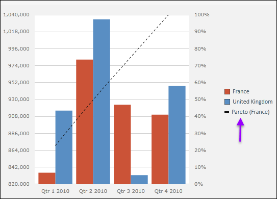
The Pareto function allows you to integrate Pareto lines within the plot area of a chart. Grid values are represented by the standard chart, while cumulative percentage values are contained within Pareto lines.
- Each series in the chart can be assigned a single Pareto line.
- Each Pareto line can be customized using line type, color and data labels.
Adding Pareto Lines
Click the Data Discovery/Analysis/Pareto button to display the command list.
Select Add Pareto and choose a Series.
By default, the Pareto line is displayed on top of the existing chart (as shown below).
Editing Pareto Lines
Right-click a series name in the legend to access series commands.
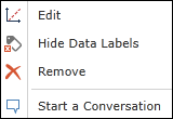
Click Edit to open the Series Editing dialog.
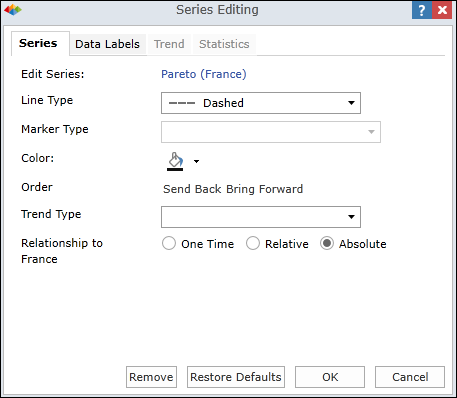
Use this dialog to customize the Pareto line displayed for the series:
Line Type - Choose a line type (Solid, Dashed, Dotted).
Marker Type - (not available for Pareto)
Color - Choose a line color.
Order - Choose visibility order in relation to other charts/series in plot area (default is in front).
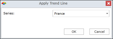
Trend Type - Should be left blank. (Choosing a trend type will turn the Pareto line to a trend line.)
Relationship to
- One Time - Changes maintained until the underlying query is changed.
- Relative - Changes apply to the series which occupies the same relative position in the series list . This approach is useful when the series list may change based on user interaction.
- Absolute - Changes apply to this particular data series only, regardless of changes to query.
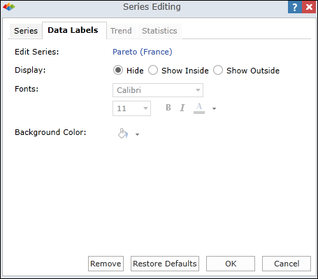
Data Labels
Edit the data labels as desired.
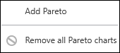
Removing All Pareto Lines
Click Remove all Pareto charts to remove all Pareto lines from query.
Home |
Table of Contents |
Index |
User Community
Pyramid Analytics © 2011-2022